Friday, January 17, 2014

Guest Blog: Bettye Griffin and Secrets

Welcome Bettye Griffin to the blawg!
***
If you’d like to get the full schedule of where Bettye’s characters are visiting this week, please check her blog.

Secrets & Sins by Bettye Griffin


In this sweeping, 115K-word novel, Bettye Griffin introduces readers to the Cheeks family of Zion, Illinois: Eldest daughter Faye, whose placid, orderly life is about to be disrupted in a way she never could have imagined...middle child and only son Scott, who brings new meaning to the phrase 'midlife crisis'...and youngest daughter Robin, who is divorced from but not exactly rid of her former spouse.


At the center of the story is their mother, Julia Scott Cheeks, who along with her devoted husband Melvin, has tried to keep two scandalous family secrets hidden and has been successful for 55 years...but when Robin mentions the name of the former classmate she has a romantic interest in, Julia fears that the events she has tried so hard and for so long to keep her children from knowing are in danger of being exposed...
-------------------------------
Bettye would love to give a complimentary download of Secrets & Sins to a reader. To be eligible, all you have to do is leave a comment before midnight Central Time today. There must be at least two comments left for an eBook to be given away, if there is only one there will be no prize. Bettye will post the name of the winner tomorrow morning, so please check back, for she will need to hear from the winner.


And now, today’s character sketch:
-------------------------------


Zion, Illinois, January 2010


I’m Diana Major McMahon. I’m 55 years old and am right back where I started: Zion, Illinois…and broke as the day I was born.


I was born here, but moved to St. Louis when I was 17. I was unmarried and pregnant, and every day I had to endure comments from my parents about how it was all my fault that they had to leave their home and friends behind. You see, the reason we moved wasn’t so much just because I was pregnant, but because I knew the baby was going to be biracial. My parents were beside themselves when I broke the news, worrying about what all their so-called friends would say once it became apparent that their daughter had spread her legs for a black guy. My mother even suggested they tell everyone I’d been raped…except one of our neighbors was a policeman and would have known about it. My father arranged for a job transfer, and to rent our house in Zion to a colleague, because it was their intent to return to there as soon as I could stand on my own two feet. They longed for that day. Never mind that they were merrily planning their return well before I even had a high school diploma.


I gave birth to my daughter, Sabrina, and then got my GED. I worked nights at a supermarket and studied when I could. Then I went to a technical school to learn computer programming, which was a hot profession back then. I’d been working for three months when my parents informed me they were going home. They helped me rent and furnish a one-bedroom apartment for Sabrina and me. They told me they’d be back to visit us when they could…in other words, don’t visit us; we’ll visit you. They still didn’t want their friends and neighbors to know they had a mixed-race granddaughter.


I resolved right then and there that I was going to make it. I was 22 with a 5-year-old daughter. I’d managed to have a sex life once I got out on my own, after Sabrina was in bed for the night. She never knew what went on after she was asleep; I didn’t want to expose her to a parade of lovers. Looking back, having sex with the knowledge that you could be discovered at any moment added to the excitement. With no bedroom of my own, my partner of the moment and I would do it in the bathroom or in the coat closet, and occasionally on the sofa, always half-dressed, always ready to spring to our feet if the door to Sabrina’s bedroom opened. I was always drawn to black guys; I’d never experienced sex with a man of my own race, but eventually I got tired of illicit relations with men who were always broke and had nothing else to offer me but a bottle of cheap wine and a hard dick. I knew guys who made nice salaries from work, but they were always married.


Then one day at the supermarket, Sabrina wandered away from me. I was frantic when I saw she was gone, and I rushed to the customer service desk to report it…and there she was, smiling and holding hands with a clean-cut, handsome, brown-haired man with a lock of hair that kept falling over one eye. His name was Larry McMahon. He hadn’t wanted to leave Sabrina until her mommy came to get her.


Larry was a rising financial star, an accounting director at a manufacturer. He asked us to lunch on the spot, and we went. I was thrilled at my good fortune. This good-looking, free-spending man was interested in me. Sabrina’s biracial heritage didn’t bother him at all. I soon learned that I needn’t have worried about him being able to satisfy my strong sex drive. Well-off, handsome, and a great lover…I was in heaven.


When he was promoted to corporate treasurer, he asked me to marry him. I hesitated, thinking of how wonderful my life could be: manicures, pedicures, facials, shopping, the gym, lunches with girlfriends. I didn’t want to tie myself down with diaper duty unless it was a deal-breaker. I told him that I wasn’t sure if I’d be able to have any more children due to some unspecified female problem, and that I didn’t think I was made to be an adoptive mother. He said not to worry, that he loved Sabrina like she was his own.


Sabrina asked me about her daddy as soon as she made friends who had two parents. I told her that he really hadn’t wanted us around, so it was just the two of us. I was so happy when Larry asked her if he could be her daddy. Heaven knew I couldn’t tell either Sabrina or Larry the real story…


Anyway, Larry and I got married, and he kept climbing the corporate ladder. Eventually he became the CFO of a beverage corporation. We lived the good life…a mansion in a pricey suburb…private school for Sabrina…wonderful vacations…furs…jewelry. I had a housekeeper and always drove a sleek late model car. How I gloated when my parents came for one of their rare visits.


The party continued for thirty years. Larry suffered some financial setbacks from investments that went south. He told me we needed to tighten our belts, and I tried, I really did. I honestly didn’t think it was that bad. He kept the magnitude of our financial situation hidden from me. It wasn’t until after he died that I found out just how bad things were, that the years of high living were over and that I’d been left with nothing.


So here I am, back in Zion. I hate to say it, but the best thing my mother did for me was pass away when she did. My father had died a few years earlier, and her passing meant Sabrina, her kids, and I would have a place to live. My brother, Mark, and I had never been close. He’s a college professor at the University of Wisconsin in Madison and didn’t want the house, which had been left to us jointly. The house is paid for, but Mark said if I wanted to live in it, I’d be responsible for taxes and upkeep.


I hadn’t worked in years, and jobs writing code aren’t nearly as plentiful as they used to be anyway. Sabrina was a trained LPN, and not only hadn’t she worked in years, she had never really warmed to the profession. Besides, not having an RN degree limited her earnings. Since both of us knew how to type, we got administrative positions at the largest employer in the area, Abbott Labs.


So I’ve gone from living the high life to barely eking out a living. I can’t remember the last time I bought something new for myself. There’s a possible way I can get my hands on some money, though. Now that I’m back in Zion, I’m hoping I can get the answer to the question I’ve been wondering about for 38 years…


Which one of the guys that I slept with in high school got me pregnant?
----------------------------------

Read more about Diana in Secrets & Sins, out now! Kindle owners can get it at Amazon or at Bettye’s eStore. Readers needing EPUB or PDF formats can get theirs from Bettye’s eStore, where eBooks always cost less, usually $1. You can always whet your appetite by getting the FREE download of the prequel, Sinner Man, which is available at Amazon, Barnes & Noble, and at Bettye’s eStore.

Saturday, January 11, 2014

Sequel Bait, ARCs and Upcoming Releases

Were you aware the Dirty Scot had a brother? Well, he does and his story is coming soon.
***

Keri Pearson is currently between jobs, so there's nothing to lose when her cousin promises her a glowing recommendation from a top expert in their field in exchange for a small favor. All she has to do is lie about who she is and pretend to be married to a charming Scot for three hours. Her sexy-as-hell pretend husband makes it too easy to play the part of newlyweds. The last thing she should do is trust him or the genuineness of his lust or adoration, but his touch ignites an unexpected desire.

Tristan Baird turned his back on his past with plenty of regrets, but when his brother blackmails him, Tristan can’t say no. Given his brother saved his neck, an afternoon doing what he does best doesn’t seem like too much to ask. And it’s for a good cause. Doing the job right guarantees his brother and new wife will have the home of their dreams. But his stunning accomplice complicates the job. She is everything he always wanted and couldn’t have. The kind of woman who is too smart to ever trust a former conman.

The three-hour commitment stretches into five sexually charged days as they fight the explosive connection. As each day passes, Keri must remind herself what is true and what is false, but the lines are blurring. Tristan can only hope his past doesn't come back to ruin their future.
***
If you're interested in receiving an ARC for this book, you can fill out a form here. I'm hoping to have this baby out on Feb. 20th. I shall keep you updated.

Friday, January 10, 2014

Homespun Cover Making: Part 4

Warning: By no means am I a professional graphic artist or a teacher.

This post is going to have a lot of print screen and I can tell you now that I probably didn't include enough. lol So strap in and get ready.

Personally, I don't like the gradient alone. So let me try some other avenues. We're about to get REALLY fancy. I'm heading to the layer list. I'm right clicking the couple. A menu pops up and I'm choosing Edit Layer Attributes. (Don't forget to click ok.) I'm picking the Fuzzy Select Tool and I'm going to get rid of that gray background. I'm clicking that gray and it's going to select a lot. Some things I don't want to get rid of. But that's okay because I haven't had coffee yet. I'm picking the Eraser and erasing everything within that Selection that I don't want to keep. I'm getting old so I'm changing the View too.


Now I'm picking that Erase tool and shall get started.


Yeah...

So now I have the couple, sans background. Let's make things interesting. I've SAVED AS. If you don't have a White Background layer, add one behind the couple. I've reordered the layers and put my title and name below the White Background Layer. As you can see this sucker is bare and needs work. This is when I just have to say I play around until I hit on something that works.

Let's go back to those gradients. 3 blendings later at 100 percent opacity in that background...

Still totally missing the mark. Let's put some in the front of the couple. I do this by picking the couple, right click, New Layer. I don't want the Opacity so strong. So let's go with 30 percent.

Not enough. Let's just duplicate the layer.

Still so bare. This is when I go to my huge file of stock photos. If you don't have one, get one. Lol I have textures, cityscapes, landscapes, etc. When things feel like this I use my rule of three: Object, background, font. In this case the object is the couple. I've cut out the background so I should replace it. If I pick the right background, all I need is to put my font back in and voila, the cover looks full and complete. I'm sure there's a technical name for this, but I don't know it because I'm not a professional graphic artist.

I have a background. I'm picking this because there's some red in it. I'm hoping they compliment each other. I don't know because I'm just playing at the moment. I'm cropping a bit of it by using the square selection tool from the toolbox. I'll copy and paste it as a layer into the cover. (Most of this stuff is pretty simple. It's exactly what you'd do if you were sticking a picture file in Word.)


Now. Don't scream. Reorder the layer so it's beneath the couple. (Click on it and drag it down.) Scale so it fits fully behind the couple.

Somehow, it works. But I don't want this to look like some Walmart picture where you can see the folks are sitting on something. Let's play with the couple a bit. Right click the couple. Edit Layer Attributes. Ok when that dialogue box pops up. 


Er. Too far down. Scaling and moving them a bit to the side.

 Ha. We're getting close.

I'm going to try to make the cover look more cogent. This is where things get tricky. I'm putting the font back where it needs to be by dragging it from the bottom to the top. I'm right clicking the couple. The menu is going to pop up. I'm going to Duplicate Layer and drag it down below the White Background Layer. I don't want to lose the original. If I mess up and the undo option is out of the picture for some reason, I have the original couple. 

Now at the top of the Layer-Gradient list will be an Opacity bar. (It's blue) I'm going to play with this. First, I'm going back to the original couple layer, right click, Edit Layer Attributes. I'm going with 92 percent.


I'm going to do something similar to the cityscape background. (Right click. Edit Attritubes. Ok.) This time I'm going with 80 percent.

Not bad, but did I mention I'm anal retentive?

Let's go back to the couple. Right click. On that menu list there's an Apply Layer Mask Option. When that dialogue button pops up, choose White (full opacity). Add it. When you look at your layers list, there should be a small box next to the couple.

Nothing has happened to the actual couple. That's a good thing, because if it had, then you should scream and undo. Choose the blending/gradient tool. Make sure the two colors are black and white. Now look at the Tool Options dialogue box and make sure the FB to BG option is picked. Blend.

The bottom half of your couple should have disappeared a little.


I sit back, look at the cover and realize I'm just doing a tutorial.

Yup. I'm done. This should be enough info to make some covers. Best of luck.

Any questions, ask them in the comments.


Thursday, January 09, 2014

Homespun Cover Making: Part 3

Warning: By no means am I professional graphic artist or a teacher.

We're getting fancy. I might move too fast so ask any questions in the comments. The goal is to do the same cover just with a gradient.

First thing first? SAVE AS. Come on, you had to know that was coming. Since I don't want to redo all the font work, I'm pulling it down below the White Background Layer. That involves clicking on the various layers and dragging them down.

Next: New Layer. Right click either the image or a particular layer in your Layers-Gradients list, you get a menu. Pick New Layer. I cannot stress New Layer enough or even duplicate layer. If you're going to start changing things, don't do it to the original.

Once you click New Layer, a menu pops up. You want the last option: Transparency. It's going to look like nothing is added until you look at the Layers-Gradient list. There's just a blank layer waiting for ya.

Now to blend.

I'm going to choose the blending tool. It's highlighted in blue in the Tool Box.

The options I chose, you can see those on the right, are FB to Transparent. I'm leaving the Opacity at 100 percent.

(If you don't know the names I'm using, enlarge the pic and find it. )

I want the bottom half blended to better bring out that whatever font I use in that area.

That line you see is the direction the blending tool is going to go. If I wanted to start in the corners, then I'd hold down the left mouse button, hold until I got to the part of the cover that would have the most faded part of the gradient.


So, I did the gradient tool twice so it was really dark by their legs. 


Boom. I'm done. Let's put back my name and title.


Sunday, January 05, 2014

Homespun Cover Making: Part 2

Warning: By no means am I professional graphic artist or a teacher.

This is when I take those wispy ideas of what I want and see if I can find a picture that can make it tangible.

After spending quite some time looking at feet, I decided not to go with feet. I'm going to show you two different ways to make a cover. The simple, headache free one. Or headache-ish free one. And one that's a bit more advanced.

My advice?

Find a good stock. Good stock makes your life easier, especially if you are new at this. Especially if, like me, you're not a professional and can't take a so-so stock and turn it into a masterpiece.

A few tips when you hit a stock photo site”
Read the license that way you know what you can and cannot do with the stock.

Have a criteria. Full body, only the torso, dark background, white background, indoors, outdoors, etc. If you know you want a woman's legs and she's wearing heels, it helps if you know you need stock with her either standing up or sitting down.

Know when to give yourself a break. Looking for stock can be overwhelming.

Lightbox or save stock. You never know when you might need it or if that one pic you hated somehow because wonderful.

So, I picked this stock for this blog:


I can look at it and know I can keep it as is and slap some font on it and it'll look fine. I'm not working with print, I'm doing digital. Right now, the biggest you can upload to Amazon is XXXX by 2500. Since I'm not making this part of a series, I'm just going to go ahead and scale the image down to 2500.

(I'm using GIMP. If you have Photoshop or something else, I'm not sure how much this will help you. But I will say there's a lot of crossover in all these programs. You just have to find the right tool.)


Now. SAVE AS. Not, SAVE, but SAVE AS. You want to keep the original pic as is. Do all your dirty work on a copy.

* Did I mention I'm anal retentive? Well, I am. So what I'm going to do is crop the stock. I personally don't like all that space around them. I want to focus on the couple. Copy, paste as new image. SAVE AS.

* Tip: If you're finding you have to do any scaling make sure you keep the same proportions. Otherwise your couple or stock is going to start to look funky. Or, rather it's going to have that fun house mirror look.


So, I've cropped and dropped them into a new file. I'm basing this new file dimensions from Under His Kilt, which I know is 1740 X 2500. I've pasted, now I need to scoot them over to the middle.

All right. No bells or whistles, I'm slapping on font. I need something contemporary and clear. And so it begins...

And just when you think you have something great, change the View to thumbnail, which is about 6 percent.

Thus, my rant about font. And then you find something that doesn't make you scream and that you can see at thumbnail. If it passes those tests,  find a font for your name. It shouldn't clash with your title. If you're going in knowing the font for your name, then it's the other way around.


Since this is a tutorial, in a sense, I can live with this. I added something to the name and title to make it pop. Some folks hate drop shadow. I'm personally addicted to it. If you hate it, then you can definitely just duplicated the text layer. (Right click the Text Layer [the little box right next to the Text Layer], menu pops up and there's a duplicate option.)

All right. That's the slap on version. See what I mean about good stock?

Homespun Cover Making: Part One

Warning: By no means am I professional graphic artist or a teacher.

The first step to cover making for me is to figure out what the hell I want. In part, it's looking at what other books in my genre look like. If you're following along, I cannot stress enough, don't skip this step. It's not enough to make a cover. The point of the cover is to sell your book.

I repeat. Don't skip this step.

Why?

I'm sure someone's done the actual math, but I'd say you have less three seconds to tell someone what the book is about with your cover. (Don't believe me, go to your favorite place to buy books and see how fast you scroll through those covers until you stop. And take a minute to study the cover you stopped on.) I personally like to brand my series. In all honesty, I should do a complete overhaul of all my covers and brand all my books. But hindsight is 20/20 and right now my time is limited. That's neither here or there. Before my time runs out I want folks to be able to guess the genre. If I've done my job, I should be able to convey the heat level.

So, when I'm looking for what I want, I hit Amazon. They have an incredible search engine. I write contemporaries so I type in “contemporary romance.” I even cheat a little and go to the top 100 bestseller lists sometimes.


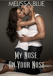
I like the look of this. It says erotic to me. So I have the option of picking just the hero or the heroine to be on the cover.


Again, I like this. I've seen something similar so I know it's likely a romance. I'm picking up these cues from the way the material is swirled. The font of the title. You likely won't see that font on Of Mice and Men.

To couple or not to couple?


Modern clothes on a couple in a heated embrace. Clean fonts that you can see in thumbnail. A script that's bigger than the rest of the words.


There's a couple with inanimate objects and vectors. Very bright colors so I'm guessing this is going to be a light and fun contemporary. With the above, there's a banner. I'm not a fan of them. Until I hit a snag and then all can be solved with a banner. The kind of snags I'm talking about has everything to do with font. I might set aside a whole post about font, because it can make or break your cover.

So even though I'm not a fan of banners, I'm keeping them in mind. Matter of fact, I'm totally in love with Farrah Rochon's Moments in Mapeville covers. She could, conceivable use every color of the rainbow and still you'd know it's a series because of the banners used, the inanimate objects, etc.


This is important and smart because font is a very important factor.


A gradient is definitely a good replacement for a banner. So I could put my name and the title at the bottom or top of a cover. Hell, if I'm feeling fancy, on the side.

Even though I like this cover, it's just too dark for what I write:


And speaking of landscapes.


A couple, just their feet:


Hands instead of feet.


Just by doing this I'm getting a better picture of what I want. I'd rather use a gradient than a banner. I don't want couples unless it's something like their hands or feet. If I do find some hands and feet, it'll be “sweet-ish” instead of “erotic-ish” because that's the tone of my story. I want a light color scheme. Because I've done this cover making before, I want to steer clear of scripts for the fonts, along with black and white stock photos.


The next part is likely going to be the most time consuming. I'm heading to stock photo sites. Blergh.