Warning: By no means am I professional
graphic artist or a teacher.
This is when I take those wispy ideas
of what I want and see if I can find a picture that can make it
tangible.
After spending quite some time looking
at feet, I decided not to go with feet. I'm going to show you two
different ways to make a cover. The simple, headache free one. Or
headache-ish free one. And one that's a bit more advanced.
My advice?
Find a good stock. Good stock makes
your life easier, especially if you are new at this. Especially if,
like me, you're not a professional and can't take a so-so stock and
turn it into a masterpiece.
A few tips when you hit a stock photo
site”
Read the license that way you know what
you can and cannot do with the stock.
Have a criteria. Full body, only the
torso, dark background, white background, indoors, outdoors, etc. If
you know you want a woman's legs and she's wearing heels, it helps if
you know you need stock with her either standing up or sitting down.
Know when to give yourself a break.
Looking for stock can be overwhelming.
Lightbox or save stock. You never know
when you might need it or if that one pic you hated somehow because
wonderful.
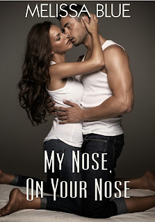
So, I picked this stock for this blog:
I can look at it and know I can keep it
as is and slap some font on it and it'll look fine. I'm not working
with print, I'm doing digital. Right now, the biggest you can upload
to Amazon is XXXX by 2500. Since I'm not making this part of a
series, I'm just going to go ahead and scale the image down to 2500.
(I'm using GIMP. If you have Photoshop
or something else, I'm not sure how much this will help you. But I
will say there's a lot of crossover in all these programs. You just
have to find the right tool.)
Now. SAVE AS. Not, SAVE, but SAVE AS.
You want to keep the original pic as is. Do all your dirty work on a
copy.
* Did I mention I'm anal retentive?
Well, I am. So what I'm going to do is crop the stock. I personally
don't like all that space around them. I want to focus on the couple.
Copy, paste as new image. SAVE AS.
* Tip: If you're finding you have to
do any scaling make sure you keep the same proportions. Otherwise
your couple or stock is going to start to look funky. Or, rather it's
going to have that fun house mirror look.
So, I've cropped and dropped them into
a new file. I'm basing this new file dimensions from Under His Kilt,
which I know is 1740 X 2500. I've pasted, now I need to scoot them
over to the middle.
All right. No bells or whistles, I'm
slapping on font. I need something contemporary and clear. And so it
begins...
And just when you think you have
something great, change the View to thumbnail, which is about 6
percent.
Thus, my rant about font. And then you find something that
doesn't make you scream and that you can see at thumbnail. If it passes those tests, find a font for your name. It shouldn't
clash with your title. If you're going in knowing the font for your
name, then it's the other way around.
Since this is a tutorial, in a sense, I
can live with this. I added something to the name and title
to make it pop. Some folks hate drop shadow. I'm personally addicted
to it. If you hate it, then you can definitely just duplicated the
text layer. (Right click the Text Layer [the little box right next to the Text Layer], menu pops up and there's a duplicate
option.)
All right. That's the slap on version.
See what I mean about good stock?


2 comments:
Hey Mel what size image did you purchase from Deposit Photos? Which resolution is the best to get?
I get the extra large. They tend to be like 3000 X 4000 something or the other. From what I've seen they usually are 75 dpi. When I scale the image down I usually put in 300 dpi to change it. You get a better resolution that way.
Post a Comment